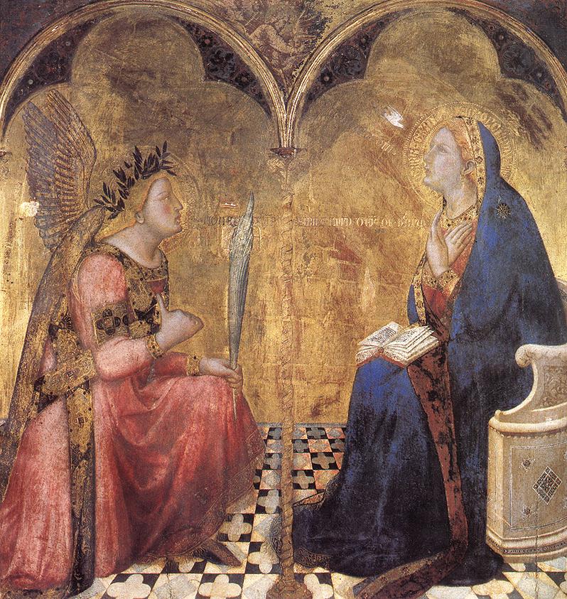
Fig 1 The Annunciation by A. Lorenzetti is typical of the flat Middle Age style, with one exception: it is famous for being the first picture with a true perspective (applied to the pavement alone)[1].
Data imaging
G. Pépy, Laboratoire Léon Brillouin, CE Saclay, 91191 Gif sur Yvette CEDEX, France
pepy at llb.saclay.cea.fr
Introductory lecture for ECNS99, Budapest.
Introduction
The title given to this paper is deceiving: while it looks accurate the field it covers is vanishingly difficult to describe once you want to define it. Therefore our first task will be to define our subject.
The most classical way to illustrate data is to use "data points" on a graph and, hopefully, to draw a line to match the points. When a theoretical model is at hand this curve is usually obtained by fitting a model through a program on a computer. These two main elements are normally completed by error bars. All this allows the reader to appreciate the quality of the experiment and the depth of the understanding of the author. For the neutron scatterers, who are most of the audience of this conference, the ordinate is usually some neutron counting (intensity), while the abscissa may be extremely diverse : scattering angle, reciprocal space momentum, time of flight, energy transfer…
However this type of graph is so classical that it raises few questions, we shall therefore address to the more complicate cases when the function to represent (still some intensity) is a function of several variables, which are not necessarily plane coordinates. This we shall call "data imaging". We are going to discuss the technical aspects.
Before going to the technics of "data imaging" let us consider for a while the usually forgotten other side of the subject: namely the person who looks at the "image". Indeed the technics used for representing data should try to take into account two human peculiarities : prejudice and sensitivity. Let us take a few examples to illustrate the point .
The way people build images is strongly dependent upon their world representation. Let me remind you that during Middle Age in Western Europe people were using images, paintings, mosaics, statues mostly for religious purposes or to exhilarate the highlights of noblemen lineages. These representations were never requested to represent reality or nature, words of little meaning for the people; on the contrary they were meant to act as powerful symbols, supported by a codification clear to everybody sharing the same community. For example the Church never cared about the expression of the saints’ visages or their surroundings, they were merely represented in a way to remind the audience about their (assumed) life in order to testify for the Christ. In the same way noblemen cared more about the number of the towers of the castles (which signed power) than to a representation of their actual architecture and surrounding landscape. All the images are flat because they describe nothing, they are a mere evocation.
|
|
Fig 1 The Annunciation by A. Lorenzetti is typical of the flat Middle Age style, with one exception: it is famous for being the first picture with a true perspective (applied to the pavement alone)[1]. |
Therefore the attempts of the early Renaissance, the Italian Quattrocento to find ways (Fig1) to give a "true" representation of the subject, either a person with its sentiments, or the architecture of a building, or the organisation of a landscape, was a revolution : the interess of the audience had changed, it now expected information beyond symbols [2] .
In the same way the images we build to represent our data should depend on what feeling the author want to pass to the reader; if this was not the case a simple set of pictures would be enough !
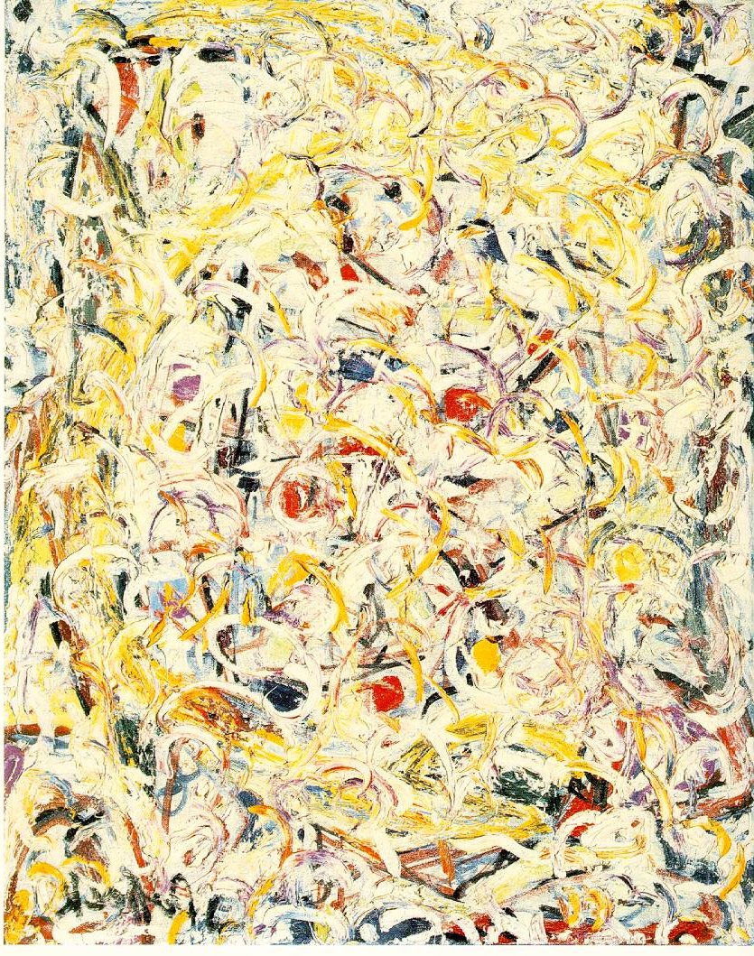
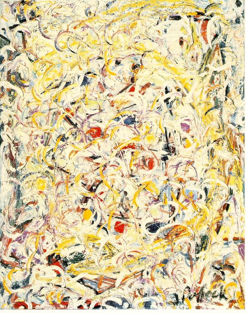
The second human characteristic which we must consider is the eye sensitivity, more precisely the human eye+brain sensitivity. The most obvious is the sensitivity to colours: we do prefer colour images to black and whites. A less known property is a physiology law which says that the effect on eye is proportional to the logarithm of the excitation: the consequence is an intrinsic difficulty to represent many different levels of intensity through grey shades. A third characteristic is the brain sensitivity to geometry. To illustrate the latter let us consider a modern painting (Fig2a). A non educated eye will find rather little information in it, let alone emotion. Let us now consider both Fig2a and Fig2b derived from the previous one by a symmetry. Once looking simultaneously at Fig2a and Fig2b, structures appear that were not easily seen before.
|
|
Fig 2 "Shimmering substance", J. Pollock [3] The original picture (Fig2a) is on the left. Fig2b on the right is obtained by symmetry. Viewing both pictures enhances structures not easily seen in each |
The conclusion of this long introduction is that:
- there is no unique, natural way to represent data, the author of an image can and must try several points of views
- the image must be built in order to match best the sensitivity of human observers.
Criteria.
Let us first explicit what neutron scatterers expect.
Most people involved in data imaging will do the following (inspired from[4])
- access to the data, usually from a stored file
- display the data on a screen and make hardcopy on a printer
- manipulate their data
- fit a theoretical model to the data.
The same person will indeed have different request according to circumstances.
During the initial measurement itself the experimentalist can usually look at few images on its terminal. Thence he wants to save on paper or at least to call back on the screen the most significant spectra already obtained in order to manage the experiment. These operations must be easy, without much learning ; availability of various imaging possibilities and a few manipulations to correct data are welcome but not essential. A flat, colour image is usually enough, provided that exist some possibilities to enhance some features, like changing the intensity scale or the colour palette.
Then comes the interpretation phase. The scientist is still interested by file corrections but access to relevant models is now essential as well as the possibility to select the significant data (masks). It is straightforward to see that to apply a selection (mask) to a picture is practical on a flat representation only. To build an appropriate model it is nice to have a user friendly, possibly limited set up, in order to start some analysis before going deep into the work; this latter phase usually requires to read a manual, preferably on line. A very difficult problem is the comparison of the data and the model. A general quality figure is the value of the quality function for the fit (most often the c 2). This is of little help if something goes wrong. The most usual way is to make narrow cuts in the image and to project the data along the line of the cut, reducing the problem to the usual calculated curve to compare to a 1d data set. An other, less frequent, way is to build a difference measured-calculated data set and to display it as the data set image; this is extremely useful to fast identify mismatched areas. As a matter of fact, the cut and projection on some axis keeps being the most common representation to display experimental results and the only one to allow to include error bars. In many cases classical data evaluation requires it. For instance SANS scatterers like to draw "Zimm plots": in case of anisotropic spectra the meaningful method is to draw 1/I=f(q) graphs for a set of angular sectors. The fitting task is hardwork, its is therefore useful to have the possibility to keep images and fitted files with all the relevant information in case it is necessary to rebuild them after a while.
Finally comes the time for publication and seminar; as most scientific journals accept only black and white picture the range of possibilities is much narrowed, usually to contour lines, which most often offer a rough information. For seminars or paper covers a 3d image with nice colours is much appreciated.
Generally the "data imaging" problem consists in representing a function like f(x,y), where f is an intensity and x,y are Cartesian spatial coordinates of a multidetector. However the time of flight experiments may compel to use more complex coordinates and representation (see below the part devoted to ISIS). New requirements will also appear : beyond the common acquisition of data sets versus temperature T, in more and more experiments there may be an extra variables like an hydrostatic pressure P, a rocking curve angle w , or a shear flow g . We shall have to find ways to represent accordingly the data and to fit simultaneously several data sets.
Most of the data treatments take place where the data files have been obtained using the available programs. Meanwhile more and more users want to make quietly the data treatment at home. The problem of the portability of the program is appearing. Many of the big programs made by computer specialists at the biggest institutes are built over a commercial infrastructure (OpenGenie in ISIS, LAMP in ILL, NewSAS in LLB). The interested user must thence get the relevant license (IDL for OG and LAMP, PVWAVE for NewSAS). Some others (XPLOTS in ILL, PXY in LLB) are based on a free graphic base (PGPLOT [5]). Many of these software work on UNIX machines while many users like PC; the transfer is not easy. It is not always necessary as big Institutes make distant work available (BARNS in ILL [6]).
However the external users most addicted to fitting, may want to personalise their model. This is more or less possible according to the programs; the lowest level possibility is to make a linear combination of built-in functions, while the highest level programs will interpret interactively typed function and include them in the model. When the compiled objects are provided the user may link its own model functions.
Reviewing some programs.
Let us now review some of the data imaging software for neutron scatterers. They are not so
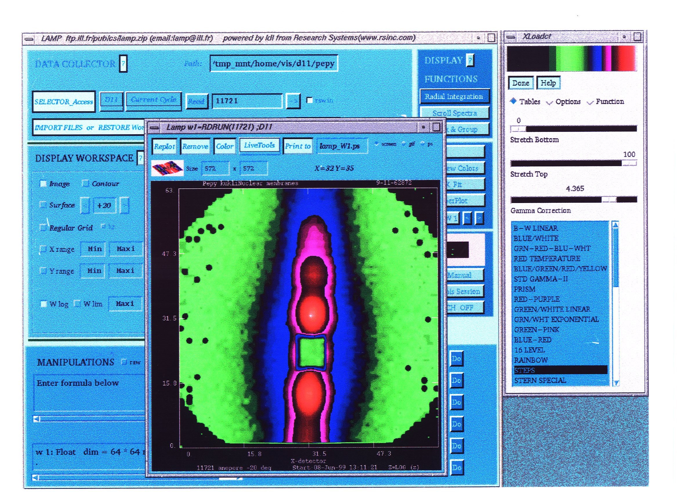
Fig 3 An example of LAMP window. In front, an image of an Anopore membrane observed by the author on D11 at very small angle. The general information is displayed on the large back window. Choice for colours is available in the right window.
many and details are available on the WEB for even fewer. The one which has probably been used by most neutronists is LAMP at the ILL[6]. LAMP was intended to provide a coherent interface for data analysis in all instrument groups at the ILL during the data-acquisition period. Consequently, this application in not dependent on the format and form of the input data and provides a macro-language which is not only similar to FORTRAN90, but also provides graphical functions and a mathematical library.
LAMP evolves in specific domains as new macros are added by users and instrument responsibles and then shared between other instruments and groups. LAMP is used by permanent and visiting scientists.
In 1999 an important new independent layer functionality was added to LAMP which allows the full power of LAMP with an intelligent and interactive access to instrument control programs. This facility, called GEORGE, permits the instrument to be controlled on the outcome of data-analysis.
LAMP uses the environment of IDL (from RSI) which at the time LAMP was conceived was the only coherent method for combining analysis, visualisation, and creation of interfaces. Today, other products, such as Matlab, can also offer this coherence, but IDL seems better suited to modern technologies, and provides a language which is more familiar to the "old-hands".
Finally, for those who wish to use LAMP in their lab they can obtain a copy from "ftp.ill.fr/pub/cs" which runs in the same fashion on Unix, Linux, Mac, OpenVMS, and Windows95/NT. For those without an IDL license, LAMP can be run over the WEB [5]. The ILL also provides LAMP free-of-charge with a runtime license. And LAMP is indeed used in many ILL users labs.
The strength of LAMP lies in the following:
- independence from data-format: almost all attributes of the data can be held in standard LAMP-variables.
- use is intuitive, and the main LAMP window
shows most of the functionality.-FORTRAN-like syntax.
-LAMP evolves via RSI (IDL), the users (macros) and the LAMP-team (the kernel), it is robust and compact).
- all platforms are supported, even the WEB and dumb terminals.
- everything is done to avoid the user reading, but getting straight on with data analysis inspection [8].
Also at the ILL, XPLOTS [9] basic principles are at the opposite of LAMP. Its single aim is to display a few data sets as fast and reliably as possible. Learning XPLOTS is a matter of minutes as XPLOTS is extremely simple, limited to the essential choices, for instance the scale choice, linear, log, square root. All significant information is shown on the output, notably filenames and intensity scale. While not exclusive, XPLOTS has been optimised for SANS. It works under UNIX or on PCs.
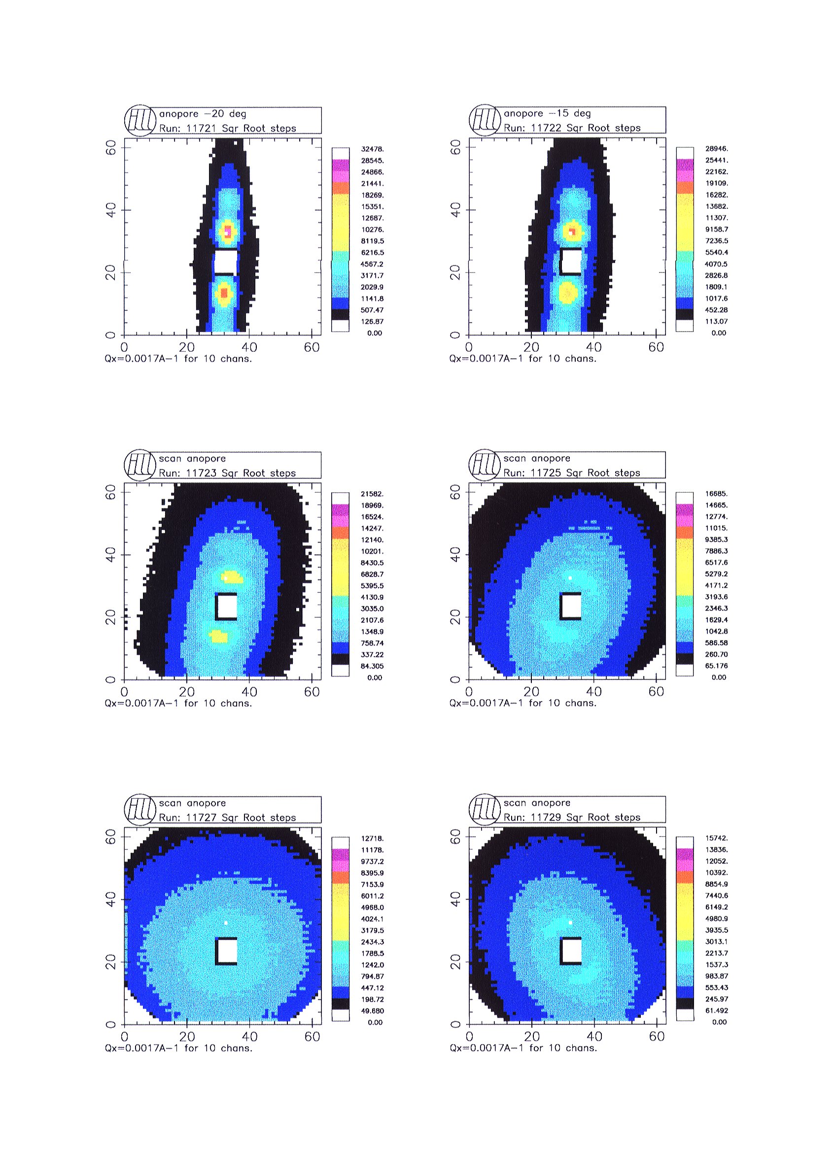
Fig 4 Example of output by XPLOTS, allowing to compare several files (again the Anopore membrane on D11) versus rocking around the vertical axis.
XPLOTS is developed by a single person; it is based on the free graphic interface PGPLOT.
Developed by the author in the LLB, the PXY program is intermediate between LAMP and XPLOTS. When PXY was started the main purpose was indeed to treat complex 2d images from SANS, it is still its main success. For comparison, PXY can display up to 9 spectra at a time. For the data treatment many masks are available (rectangle, angular sectors, double rectangle cross as in Fig 5). The basic functions are available in 1d and 2d; some functions are specific to 2d as anisotropic power law or mixed gauss-lorentz… 2d fitting takes place pixel by pixel, without averaging along some direction as was done in classical SANS programs. PXY is used for other purposes than SANS, as the analysis of X-ray data files or even video pictures. It is not limited to LLB, recently it was used for D11 files. PXY is based on the free PGPLOT graphic interface. It can be installed at home by any scientist, under UNIX or LINUX. New developments will include simultaneous fitting of several files and a PC version (somet ime later as the developer is a single scientist).
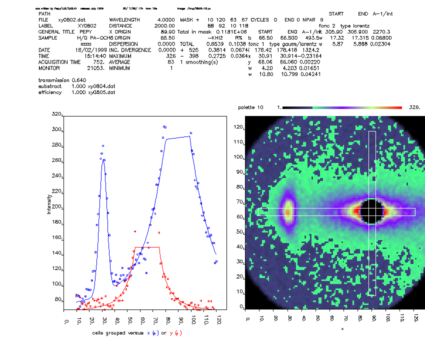
Fig 5 An example of output by PXY. All relevant information appears on a single view : the data file image with the mask, is on the bottom right, the file details and corrections on the top right, the intensity in the pixels inside the two components of the mask is on the bottom left (horizontal rectangle projection in blue, vertical one in red), the results of the fit, parameters and statistics are on the top right (an anisotropic lorentzian was used to fit the forward scattering from a polymer liquid crystal, a gauss-lorentz function for the smectic "Bragg" peak on the left). The menu is removed when printing.
GENIE is the name of programs used for the display and analysis of data from the neutron scattering instruments at the ISIS facility. The new GENIE is known as Open GENIE to reflect the intention that the software be used on a wide variety of different computers and operating systems. It is aimed at supplying scientists with an inexpensive computer package which provides them with access to their experimental data, so that they may analyse the data as required and display the results in a useful format, usually in a graphical form [4, 10].
Arguably the most important purpose of Open GENIE is as a tool for scientific data analysis as a framework which provides all the tools necessary to perform a complete analysis of the data. What is critical and is very much at the heart of the philosophy of Open GENIE is that the scientist must have control over how the data is processed .
The philosophy of OpenGenie is similar to that of LAMP. It is extremely powerful, but need reading to exploit it fully. Thence some other programs are also in use at ISIS.
As regards SANS at ISIS [11] data reduction and visualisation (1d obviously, but also colour intensity contour plots in 2d and 3d) is done with in-house programs unique to ISIS and based around DECGKS, PGPLOT and UNIRAS graphics respectively. Reduced data can be exported to other (including commercial) packages. ISIS now has a collaboration with the SAXS group at the Daresbury synchrotron which has given access to the data visualisation software developed under CCP13[12].
Indeed the nature of ISIS compels all the spectrometers to use time of flight (tof), which generates an enormous quantities of data, to be viewed and evaluated. It is interesting to look for instance to the problems of inelastic neutron scattering. Because of tof the scattering takes place on a curved surface in the hyperspace built on the 3 laboratory coordinates complemented by an "energy transfer" axis (Fig 6). In order to make possible for the experimentalist to grasp the data it is necessary to make cuts in this hyperspace; on Fig 6 is shown a subspace corresponding to the scattering in the horizontal plane, of course the scattering surface is still curved. Once the experimentalist gets used to this geometry it is probably simpler to map the data on a flat surface,
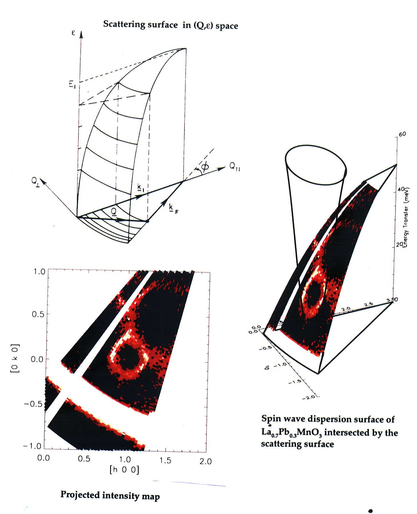
Fig 6 Representation of inelastic scattering data obtained by time of flight at ISIS. On the top left is shown the experimental geometry : the scattering plane with 2 laboratory space directions + the energy transfer, and the scattering surface. On the right the data are displayed on the scattering surface; the vertical cone describes the scattering law for the spin waves; where it intersects the scattering surface appear the neutron intensity. Finally the intensity map is projected on the experimental plane (beware of the variable energy transfer across the area)[13].
with all the trouble that Mercator had in the 16th century when he wanted to map the Earth on a flat surface… However it is very nice to get the inelastic scattering information over a large volume, but more than ever clever representation programs are required. Of course the comparison with the model keeps being as difficult as usual.
In the frame of this paper it is not possible to discuss many more contributions. However I would like to mention two interesting contributions devoted to specific problems as examples of the work done in small labs.
In SANS it is very common to get data sets at several sample-detector distances which acts like a zoom. J.M. Schneider [14] made a program which combines 3 data sets together, with logarithmic reciprocal space scaling, in order to view all pixels in an appropriate manner.
It happens especially in SAXS that otherwise beautiful data are spoiled by defects in the picture. Using skilfully contrast tools and selection N. Stribeck [15] designed a recovery program.
The canSAS network (Collective Aid for Nomadic Small-Angle Scatterers) is devoted to "Interchange programs for treated SAXS and SANS data"; its main purpose is to make easier interchange of data files, however its WEB site [16] contains a lot of information about imaging programs, useful beyond the SAS community. In particular R.K. Heenan [17] made a short critic review of fitting programs (general one dimensional data, or slices through 2d data, indirect Fourier transform methods, 2d data handling and fitting…)
Another useful source of information is the ENSA server [18].
|
|
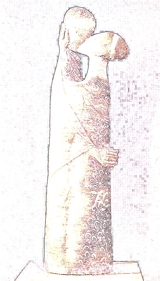
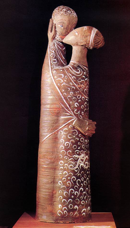
Fig 7 "Philemon and Baucis. On the right is shown the original picture of this small statue by M. Kovacs, "St Endre museum, Hungary". On the left, the information is wretched by excess contouring, or is it not ? [19] |
Conclusion
Data become information when properly looked at.
Acknowledgements
This paper benefited directly or indirectly
of contributions from M. Arai, L. Arnaudet, R. Ghosh, S. King, E. Kren, C. Lacaille, H. Lauter, L. Noirez, D. Richard, J.M. Schneider, U. Steigenberger, M. Steiner
I am particularly indebted to E. Kren for his WEB Gallery of Art" where I found the Ambrogio’s Annunciation and more… and also to Jim Grattan’s "Jim’s Fine Art collection" which provided Pollock’s "Shimmering substance".
References
[1] www.kfki.hu/~arthp/html/l/lorenzet/ambrogio/9annunci.html
[2] P. Thuillier, Espace et Perspectives au Quattrocento, La Recherche 1385-1399 160 (1984)
[3] J. Pollock http://www2.iinet.com/art/artists/major/p/pollock.htm
[4] OpenGenie http://www.isis.rl.ac.uk/GenieUserManual/
[5] http://phobos.caltech.edu/~tjp/pgplot/index.html
[6] http://barns.ill.fr".
[7] http://www.ill.fr/data_treat/lamp/front.html
[8] D. Richard, private communication
[9] R. Ghosh, private communication
[10] OpenGenie http://www.isis.rl.ac.uk/GENIEReferenceManual/
[11] S. King, private communication http://www.isis.rl.ac.uk/largescale/loq/loq.htm
[12] http://wserv1.dl.ac.uk/SRS/CCP13/
[13] U. Steigenberger, private communication
[14] J.M. Schneider, private communication, schneider at iap.phys.ethz.ch
[15] N. Stribeck, private communication, http://www.chemie.uni-hamburg.de/tmc/stribeck/canSAS.html
[16] canSAS http://www.ill.fr/lss/canSAS/main.html
[17] R.K. Heenan http://www.isis.rl.ac.uk/largescale/loq/canSAS/sasdata.htm
[18] ENSA http://www1.psi.ch/www_ensa_hn/ensa/ensasoft.htm
[19] courtesy from E. Kren and L. Rosta